Wednesday, 16 December 2009

NME contents page


This is the music magazine for NME. NME has an ideology where rock and indie music and culture is important. An example of media language that’s shows this is the images on the contents page. I think that NME target audience is young people aged between 14 and 20.

Contents pages are used to display what is going to appear in the magazine they need to be clear and precise about what is going to appear in the magazine. The title is displayed in big bold writing making it clear what magazine institute it is. The articles are under different heading making it clear to the reader what each article is about, for example New, Review.

The central article is very clear and bold this will be the main feature in the magazine. The green contrasts with the black writing making it stand out more to the reader. Also the writing in the centre is the biggest compared to the other writing around the edges.

The images on the page represent the target audience and genre. At the bottom of the page there is a promotional offer to save over £45 is you subscribe to NME now. This entices the target audience to subscribe as they think that are saving lots of money. The bands are representative of the rock/indie genre.

In the bottom right hand corner there is a box in red saying The UK’s No1 gig guide starts p58. Because this box is in red it gives more dominance over the other articles because it stands out more. It is also the same colour as NME’s logo also giving it more importance.

NME also has a website promoting bands and other various music things. Its institution purpose is commercial to make money this effects the content as it has adverts and the contents is mainly entertainment as displayed on the content page

Tuesday, 15 December 2009

Mixmag contents page


This is the contents page for 'mixmag' a dance music magazine. I like this contents page because its funky and different from the normal plain laid out ones in other existing music magazines.

I think the pictures are very bright and bold which catches the audiences eye. I like the layout its not to much squashed together everything is reasonably spaced out and is very clear and easy to read. Contents pages are there to entice the target audience more into buying there magazine by what is being advertised inside. The font and colours go with the genre of magazine because there bright and individual.

On the left hand side it displyes what is going to appear in the magazine including a brief description and page number. They are set out under different main headings these are in bigger writing and a different colour to the text describing what is in the magazine making ir very clear to pick out and scan what sort of things will be appearing in the music magazine 'mixmag'.

Tuesday, 8 December 2009

Kerrang cover analysis


The institution for this music magazine is Kerrang. Kerrang magazine follows the music genre of rock, it is mainly read by teenagers but some young adults would read it as well. The colour theme is back and white as seen in the logo. The rest of theme on the page goes with the logo colours. Kerrang shows that it is a popular music magazine to read as it has big artist’s names in bold writing, the black background and white writing helps it stand out more and catch the audience’s eye.


It is a medium shot of the band Panic at the Disco; they look laid back and are also wearing black and white cloths to go with Kerrang’s title. There is only mainly the colour red on the front page. It is advertising a free posting and the background to the text is red, this instantly catches the eye of the reader as it is the only main bit of colour on the page. Kerrang follows the main conventions of a music magazine by having the main image of a popular band on the front cover. Similar to other well know music magazines the logo is covered up by the band/artist on the front cover also displaying how popular the magazine is.

The ! at the end of Kerrang represents some of the music that is displayed through the magazine i.e. loud heavy music. Also the way you say Kerrang with the ! at the end, if you were to say it how it is spelt you would be shouting the word Kerrang like some of the music that is displayed (rock).

Monday, 7 December 2009

NME cover analysis


The institution for this magazine is NME, in this particular issue on the front cover is Bobby Gillespie he is the lead singer from Primal Scream. On front covers of music magazines there is always a band or a singer on the front cover, the more popular the artist is the better the institution is. NME has a radio station and a website this shows that it is highly popular and the radio station boosts this. Part of the logo is covered up by the singer this shows how well known NME is because people do not to see the whole of the logo to recognise who it is. After looking into NME magazine I found out that it wasn’t just on this particular issue that the logo was covered up on most of NME magazine front covers part of the logo is hidden.

On the NME website it has lots of different things to go on such as news on your favourite bands and artists. From looking at the different bands and the front covers of the magazine I think that the music genre is punk rock. You can listen to there exclusive radio station on the site, look at interviews, blogs and music videos. The website is easy to use and is nicely set out, the colours match the NME logo of red and black.

NME is very affordable at a low price of £2.20; this means young teenagers can buy it boosting its popularity. On the front cover it has many selling lines and cover lines. The main cover line on this front cover is Primal Scream; we can easily recognise the main cover line as it is usually always the biggest and boldest on the page.

Friday, 13 November 2009

Mixmag analysis


I chose to look at this magazine in because it is the type of music magazine i am going to do for my own. The audience of this particular magazine would be people who like clubbing and dance music, in this issue of Mixmag the main theme is festivals so people who have been to festivals or who like them would buy this particular issue of Mixmag. I think that students would buy this magazine because it fits their type of music as students go out clubbing most weekends. The main image is of the singer ‘Little Boots’ this is the main convention of a music magazine, it is a medium shot so you can only see half of her body and face.

The institution is Mixmag it also has a website and has a TV channel; it is commercial to make money. In the contents of the magazine it has many adverts and is mainly entertainment. The price of this magazine is £4.20 which is a little bit expensive for students but it has a free CD so this may make the target audience want to buy it for the ‘freebie’. The picture of the free CD is very doniment on the page as it is enlarged and covers part of the singer Little Boots up this show that the CD has a bigger marketing value then the singer does.

It is a medium shot of the singer Little Boots this picture is effective as it is in the centre of the page the main cover line is "festivals are go! with our lass in the grass Little Boots" we can identify this on the magazine because usually it is the biggest piece of writing. In the right hand corner there is an image of a man this is known as the ear. The ear is always in the right hand corner of the page, commonly it is usually a logo of some sort.


Thursday, 12 November 2009

LIIAR

Language- The termonoligy, Connontaion- this is the meaning we infer from what we see in front of us(the hidden meaning). Denotation-This is what you see in front of you, what is shown on the page or the screen.

Institution- Organisations (BBC), magazines/ newpapers (the sun). An instituton is anything that produces media.

Ideology- Represents the ideas about social groups and values. The system of beliefs that we share as a society. Moral values (right and wrong) Capitalist, Society/democracy. A dominant set of ideas/beliefs presenting itself as common sense or truth.

Audience- A collective group of people reading any media text. Audiences are no fragmented.

Representation- Representation of the British Society. It represents society back to us i.e values that represent our area.

Friday, 6 November 2009

Music Magazine Brief

The front page, contents and double page spread of a new music magazine. All images and text used must be original, produced by you- minimal of four images.

Thursday, 22 October 2009

College Magazine Evaluation

I read the brief it said we had to produce a new school/college magazine featuring a photograph of a student in medium close up plus some appropriately laid out text and masthead. Additionally I had to produce a mock up of the contents page. we began by creating an account on ‘Blogger’ and typing up the brief and the key concepts.
I started by looking at existing college magazines to see what sort of things would usually appear on a typical college magazine. I uploaded a few pictures of some examples of college magazines onto ‘blogger’ and deconstructed them. I used the key concepts of LIIAR (language, institution, ideology, audience and representation. I also found out what might be the denotation and connotation of the magazine front covers. I found out from my research that most of the college magazines i looked at there would be a happy looking student the front. On some there would be a girl and boy this shows equality of both sexes. The happy smiling faces suggests that it is fun to be at college. The connotation of a smiling student holding books is you can still be happy and have on smile of your face wile studying.
Once I had finished my research I started doing hand drawn drafts. One my first draft I did a picture of two people stood in front of the entrance to Wyke college, it was a long shot, in the brief it said we had to do a medium close up shot so unfortunately I had to change it. In my second draft I did the same picture but as a medium shot I also moved the masthead so it was straight and looked more professional. I also did a computer draft and found images of the school buildings and put some people on it to represent my ‘models’.
I organised for my friends to come into college and be my models so I could take pictures of them in the college setting so it looked better then editing a picture into the background. We went round college and I took pictures of them in various places of the college. I told them to smile and look like happy looking students as this is what I found most college magazines represented. Unfortunately on the day the camera ran out of memory after only four photos so I had to choose the best out and delete a few that I didn’t really want to delete. However I think the pictures I produced represented the target audience of ‘students’ well because the people I was taking photos of look like the right age to be classed as a student. When I got into college the next day I learned that a medium shot and a medium close up were two very different camera shots, a medium close up is a picture were you can only see the shoulders upwards and medium shot Is half of the body.
I started on a new draft that would be a medium close up shot as it said in the brief we had to do this type of shot. My idea was a person holding a piece of paper saying pass. This represents that you can pass your results if you come to this college. I also did a computer draft for this and uploaded them onto my blog. When in came to taking my photographs for this idea I did not like them I thought they didn’t look professional at all and didn’t look like they would appeal to my target audience of people that want to go to college and learn but have some fun as well.
I had a word with Tim and he said that it didn’t matter to much if it was a medium close up or a medium shot but recommended that it was best to go with what the brief said. In the end I went with the pictures I took with the three people in it because it looked more fun and was the better picture. I constructed my magazine by using word publisher. I got a picture of the Wyke logos and put them onto my image, the logo in the top right hand corner is called an ‘ear’. I came up with some ideas for what would be inside of the college magazine and played around with were they would go on the image and what font and colour would best go, I used a lime green colour and white for my writing and Georgia for my text I chose these because the colour went with the college logo and the text type stood out and because it is bold just like the college. At the bottom of the page I put ‘succeed at Wyke college’ as a cover line, I thought this went well with my image because they look like happy students therefore people that are succeeding in their A levels.
The strength of my magazine are its bold and stands out, the masthead is easy to recognise from a distant. The sell lines are relevant to the magazine and the colours go with the college logo. It represents the target audience for students wanting to at A level. I could of time managed better and not have left everything to the last minute also I could have done some more planning to go with my work however I think the plans I have done represent the magazine and the concepts of LIIAR very well.

Mood Board

This mood board represents my ideas and drafts for my College Magazine.

My College Magazine


Pictures


I took these pictures because I thought we could only do a medium close up shot. I do not like the pictures I have took because it doesn’t look like a image that would be the front page of a college magazine, I prefer the previous pictures I took were I hade three people instead of one. I think the sign PASS now looks silly and unprofessional. After talking Tim he said I could get away with using the previous pictures and it didn’t matter to much if it was a medium shot or a medium close up. In my final copy of my college magazine I did not use these images.

Wednesday, 21 October 2009

Computor Draft 2

I did this second computer draft because I thought I couldn’t use my other images, because of the type of shot we had to do. It is a picture of a student stood in front of a brick wall. The sign PASS represents that you can pass you’re A levels if you go to this college. When it came to taking the pictures the sign didn’t look very professional and therefore I didn’t like the pictures I had taken. Fortunately I didn’t have to use these images and went with my old idea of the group of 3 people looking happy in front of a building.

Contents Page

This is my mock up of my contents page, I kept it simple and only added a few images at the top and bottom of the page. The title 'Contents Page' is displayed down the right hand side of the page. The top image is going to be a image of the college and the bottom two images of some student and one of one of the class rooms at wyke.

Hand drawn draft 3

This is my final hand drawn draft idea, it is a drawing of a person standing in front of a brick wall they are holding a piece of paper saying PASS in their hands this is suggesting that if you go to this college you will pass you’re A levels. My slogan ‘It’s a Wyke Life’ I didn’t use it in my final piece and I used succeed at Wyke College, I changed it because I think it sounds more professional and makes the college sound like a respectable place to go.

Hand drawn draft 2

II did this second draft because I did not like my first one and also because I had to get the right medium shot/close up. In my final piece there is three people instead of two.

Hand drawn draft 1


This is my fist hand drawn draft for my college magazine. I have drawn two people stood in the entrance of Wyke college holding books. I didn’t read the brief in much detail therefore I did not know that it was meant to be a medium close up shot so I had to scribble out half of their body. Also I did not know that a medium close up was just the shoulders and head so I still had drawn it wrong anyways but I did not know this until I had taken my pictures. I do not like the was I have set out the masthead and other bits of information on the draft.

Friday, 16 October 2009

Photo's taken


I got my models to come into college so I could take pictures of them in college. I liked the poses of the models but didn’t like the background. I also thought that it was just a median shot but when I got into college the next day I found out it was a median close up shot so all the photos I had taken I couldn’t use anyways. I couldn’t get my models to come in on any other day as they live in Driffield so I decided to change my plan and ideas of what I wanted to do. So instead of having the pictures in college I would have them taken outside.


Thursday, 15 October 2009

College Magazine Analysis 2


Title/masthead- King Ed’s (name of college)The writing is big and bold in two colours Green and Pink. Green for boys pink for girls this is showing that it is a mixed college. Underneath the Masthead it says “the new Edwardian magazine” this possible suggests that it is a new magazine for the college. The title stands out and its very young and funky attracting the target audience of students.
Contents – shown on the front coverNick Love- British film director interview
Sport- Olympic hopeful, Cricket report
Academic enrichment programme- university of Birmingham
Visit to Auschwitz
Foreign exchange- Germany, France and Spain
Celebrating Diversity
The contents shows issues going on in the college and outside. Gives students information about up coming events, and what is inside of the magazine.
colours used- Green, pink, bluemain image- two students girl and boy both smiling/laughing, having fun lots of colour in the background so it looks like a really fun and happy place to be.
Target audience- students who want to have fun and learn, aimed at anyone wanting to go to college not just people with good grades.

Friday, 9 October 2009

My College Magazine- Comp Draft 1


This is my first computer draft for my college magazine. After looking at a number of different college magazines I decided to have two people stood in front of the college looking happy because it suggests happy students in college. The books in their hands suggests you cans till be happy and have fun while at college. My slogan was taken from “it’s a good life” and i changed it to “it’s a Wyke life”. The college icon is in the right hand corner of the page this is called an 'ear'. the masthead is 'Wyke College'.

Thursday, 1 October 2009

College Magazine Analysis

Title/masthead- My college class of 2009
The writing is very sophisticated and posh this possibly displays its target audience

Contents – shown on the front cover
student profile,
college news,
from the president

colours- yellow
main image of a woman lying down on a bench with books under her head
connotation (hidden meaning) – this college is not all work you can still lay down and have a break and listen to some music. The books represent you have to learn but not all the time.

Target audience- students who want to learn, well behaved with good grades, sophisticated.

Yellow strip down the side stands out from the rest of the cover, it makes is clear that its the 2009 issue

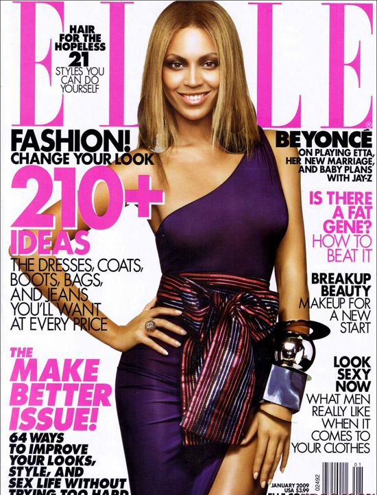
Key Concepts of a Magazine Cover Design


Masthead- the name of the magazine displayed in the typeface in which it is designed. this is visual branding of the title and is usually done in a uniquetypeface to be very reconisable
Dateline- Month and year of the publication, often with the price. Note that a monthly magazine hits the news-stands the month before the cover date
Main image- In case of this cover there is a single image of the model Beyonce. It is used in a classic way, the colour is bold enough to make an inpact on the news stand. With the model making full eye contact
Model credit- This says: 'on playing Etta, her new marriage and baby plans with Jay-Z'
Coverlines- Elle usues alot of cover lines, which are distributed around the man image without atracting from it too much
Main cover line- This is very large taking up almost a quartre of the cover area and comes in 3 big lines 'make better issue'.
Left third- In western countries, the left third of the cover is vital for selling the issue in shops were the magazine is not shown full frontage. the title must be easily recognisable in a display of dozens of competitors. the start of the masthead is important here .
Bar code- Standard barcose used by retailers
Selling Line- Shortm sharp decription of the titles main marketing point..


Wednesday, 30 September 2009

LIIAR- Key Concepts

Language- The termonoligy, Connontaion- this is the meaning we infer from what we see in front of us(the hidden meaning). Denotation-This is what you see in front of you, what is shown on the page or the screen.

Institution- Organisations (BBC), magazines/ newpapers (the sun). An instituton is anything that produces media.

Ideology- Represents the ideas about social groups and values. The system of beliefs that we share as a society. Moral values (right and wrong) Capitalist, Society/democracy.

Audience- The consumers of media, how the audience consumes media. A target audience

Representation- Representation of the British Society. It represents society back to us i.e values that represent our area.

The Brief

Preliminary Exercise: using DTP and an image manipluate program, produce the front page of a new school/college magazine, featuring a photograph of a student in medium close-up plus some appropriatly laid-out text and a masthead. Additionally you must produce a mock-up of the layout of the contents page to demonstrate their grasp of DTP.

Main task: the front page, contents and a double page spread of a new music magazine. All images and text used must be original, produced by you - minimum of four images.