Wednesday, 21 October 2009

Hand drawn draft 1


This is my fist hand drawn draft for my college magazine. I have drawn two people stood in the entrance of Wyke college holding books. I didn’t read the brief in much detail therefore I did not know that it was meant to be a medium close up shot so I had to scribble out half of their body. Also I did not know that a medium close up was just the shoulders and head so I still had drawn it wrong anyways but I did not know this until I had taken my pictures. I do not like the was I have set out the masthead and other bits of information on the draft.

Friday, 16 October 2009

Photo's taken


I got my models to come into college so I could take pictures of them in college. I liked the poses of the models but didn’t like the background. I also thought that it was just a median shot but when I got into college the next day I found out it was a median close up shot so all the photos I had taken I couldn’t use anyways. I couldn’t get my models to come in on any other day as they live in Driffield so I decided to change my plan and ideas of what I wanted to do. So instead of having the pictures in college I would have them taken outside.


Thursday, 15 October 2009

College Magazine Analysis 2


Title/masthead- King Ed’s (name of college)The writing is big and bold in two colours Green and Pink. Green for boys pink for girls this is showing that it is a mixed college. Underneath the Masthead it says “the new Edwardian magazine” this possible suggests that it is a new magazine for the college. The title stands out and its very young and funky attracting the target audience of students.
Contents – shown on the front coverNick Love- British film director interview
Sport- Olympic hopeful, Cricket report
Academic enrichment programme- university of Birmingham
Visit to Auschwitz
Foreign exchange- Germany, France and Spain
Celebrating Diversity
The contents shows issues going on in the college and outside. Gives students information about up coming events, and what is inside of the magazine.
colours used- Green, pink, bluemain image- two students girl and boy both smiling/laughing, having fun lots of colour in the background so it looks like a really fun and happy place to be.
Target audience- students who want to have fun and learn, aimed at anyone wanting to go to college not just people with good grades.

Friday, 9 October 2009

My College Magazine- Comp Draft 1


This is my first computer draft for my college magazine. After looking at a number of different college magazines I decided to have two people stood in front of the college looking happy because it suggests happy students in college. The books in their hands suggests you cans till be happy and have fun while at college. My slogan was taken from “it’s a good life” and i changed it to “it’s a Wyke life”. The college icon is in the right hand corner of the page this is called an 'ear'. the masthead is 'Wyke College'.

Thursday, 1 October 2009

College Magazine Analysis

Title/masthead- My college class of 2009
The writing is very sophisticated and posh this possibly displays its target audience

Contents – shown on the front cover
student profile,
college news,
from the president

colours- yellow
main image of a woman lying down on a bench with books under her head
connotation (hidden meaning) – this college is not all work you can still lay down and have a break and listen to some music. The books represent you have to learn but not all the time.

Target audience- students who want to learn, well behaved with good grades, sophisticated.

Yellow strip down the side stands out from the rest of the cover, it makes is clear that its the 2009 issue

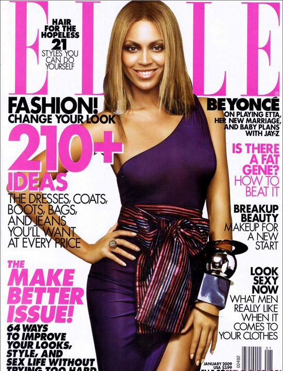
Key Concepts of a Magazine Cover Design


Masthead- the name of the magazine displayed in the typeface in which it is designed. this is visual branding of the title and is usually done in a uniquetypeface to be very reconisable
Dateline- Month and year of the publication, often with the price. Note that a monthly magazine hits the news-stands the month before the cover date
Main image- In case of this cover there is a single image of the model Beyonce. It is used in a classic way, the colour is bold enough to make an inpact on the news stand. With the model making full eye contact
Model credit- This says: 'on playing Etta, her new marriage and baby plans with Jay-Z'
Coverlines- Elle usues alot of cover lines, which are distributed around the man image without atracting from it too much
Main cover line- This is very large taking up almost a quartre of the cover area and comes in 3 big lines 'make better issue'.
Left third- In western countries, the left third of the cover is vital for selling the issue in shops were the magazine is not shown full frontage. the title must be easily recognisable in a display of dozens of competitors. the start of the masthead is important here .
Bar code- Standard barcose used by retailers
Selling Line- Shortm sharp decription of the titles main marketing point..


Wednesday, 30 September 2009

LIIAR- Key Concepts

Language- The termonoligy, Connontaion- this is the meaning we infer from what we see in front of us(the hidden meaning). Denotation-This is what you see in front of you, what is shown on the page or the screen.

Institution- Organisations (BBC), magazines/ newpapers (the sun). An instituton is anything that produces media.

Ideology- Represents the ideas about social groups and values. The system of beliefs that we share as a society. Moral values (right and wrong) Capitalist, Society/democracy.

Audience- The consumers of media, how the audience consumes media. A target audience

Representation- Representation of the British Society. It represents society back to us i.e values that represent our area.